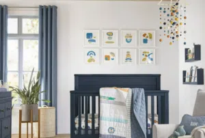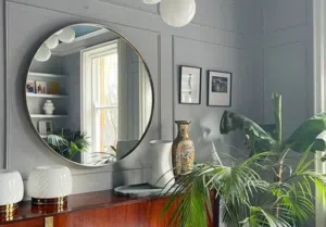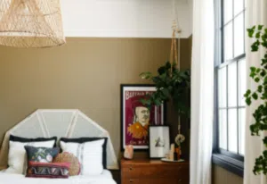
The Prestige range from Fleetwood has proven extremely popular, particularly when it comes to high-end finishes and depth of colour. So how do you use it successfully in your own home?
The Prestige brand is divided into two ranges that can easily be defined. Pantone is predominantly a modern, vibrant, and contemporary collection and the Fleetwood Vogue range has a more heritage and rich feel to its colour palette. This Vogue collection is the range that I love to use for a classic heritage look that includes neutral tones and rich deep complimentary colours.
Firstly, the initial look and layout of this card has been designed to make colour choice a breeze. All the whites and light neutrals feature on the first page, varying from bright whites like Origami White to greige and grey tinted neutrals like Shelter White and Hoxton Haze. The undertones of these neutrals are very much leaning towards a warm greige that is perfect when looking for that Scandi look or natural feels.
The centre pages feature colours such as Monet, Grafton and Kensington in varying depths that allow for rooms that have different light levels. I especially like to use the Hepburn, Gothenburg and Betsy based colours.
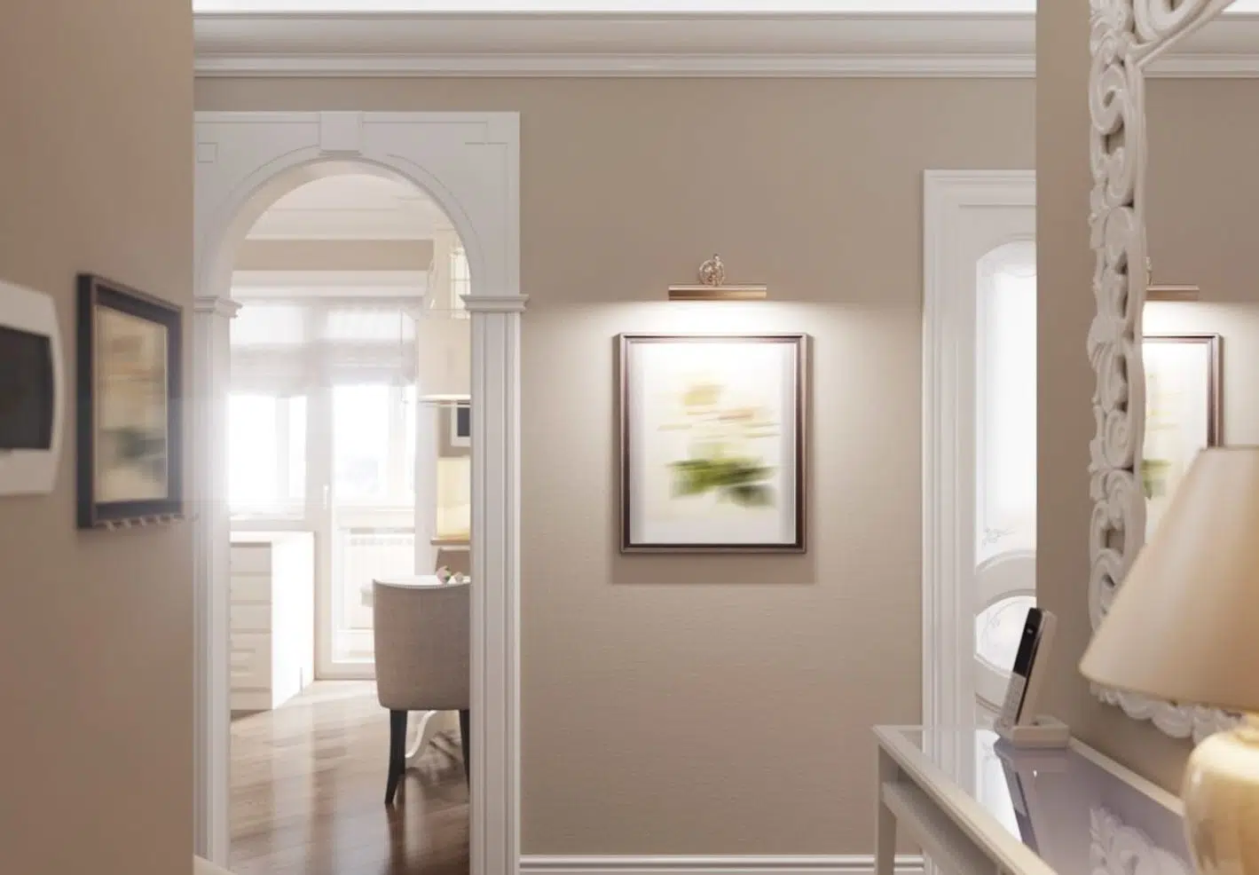
With the recent departure from cooler bluer greys to greige tones, Hepburn is a range of colours that will still give that up-to-date greyish look but with a much warmer and neutral undertone. The mid version of Hepburn is the one I most commonly use and is ideal for a neutral that works well in our Irish climate and duller light.
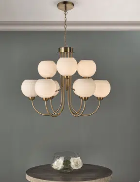
Gothenburg is a firm favourite and work so well in larger rooms for instance hallway. It is a neutral that has an elegance and definition that comes from the slight lilac tone and when teamed with a warm off-white like Highline White or Standard White the balance is perfection.
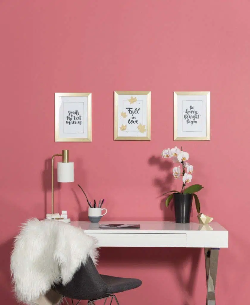
To achieve that warmer, rich mid-century look you could not be more on trend with the Besty 1920 Light or for a more dramatic feel Betsy 1920 Deep. It offers a warm clay undertone but with a blush feel, without being too feminine. Perfect for social areas like sitting rooms or dining rooms, especially when using panelling, the eggshell finish is a must. Deep tones like Kensington Grey Dark or Wynwood enhance the warm feel with their depth of colour.
The last page features a range of colours that really scream luxury and confidence. From unusual choices like Old Fashioned and Side Car to rich deep tones like Wynwood and Burnt Sage these colours are perfect for feature ceilings and smaller rooms that crave that deep moody embrace, as well as your living social area. Accessorized with brass these colours really come to life.
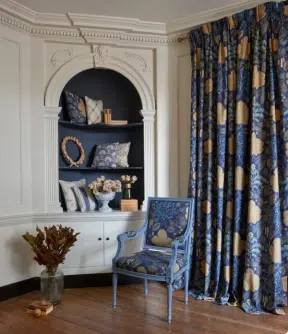
Understanding the “feel” that each colour exhudes the trick for me with the Vogue card is combining them in a different way. For instance, if I wanted to use a rich deep colour like Kensington Grey Dark on a feature panelled wall I would steer away from using a lighter version of the same shade and pick a warmer tone like First Edition to give a balanced layered neutral scheme. Having said all that, this range and layout is easier to use when choosing depth of colour and has some amazing combinations that are right on trend.
By Patricia Wakely
Be sure to follow Fleetwood Paints on Instagram for more colour and design inspiration.

