It is that age-old question of “what’s the best way to make a first impression?” and my take on it is perhaps not just to concentrate on making the first impression alone but continue that theme throughout.
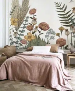
Depending on your interior, these rooms can present some challenging decisions, from the long dark Irish bungalow hallway to the high-ceilinged traditional townhouse, all hallways can be shown the love and attention usually lavished upon our favourite rooms. Although we imagine the most of our time is spent in our living room at the end of a long busy day, or the kitchen preparing our meals – it is the humble hallway that sees the most traffic throughout the day and yet can be neglected more than any other. Championing this cause and on behalf of all Irish hallways, lets diagnose the issues and prescribe some suitable treatments for tackling some of the most common ailments facing us when re-designing these areas.

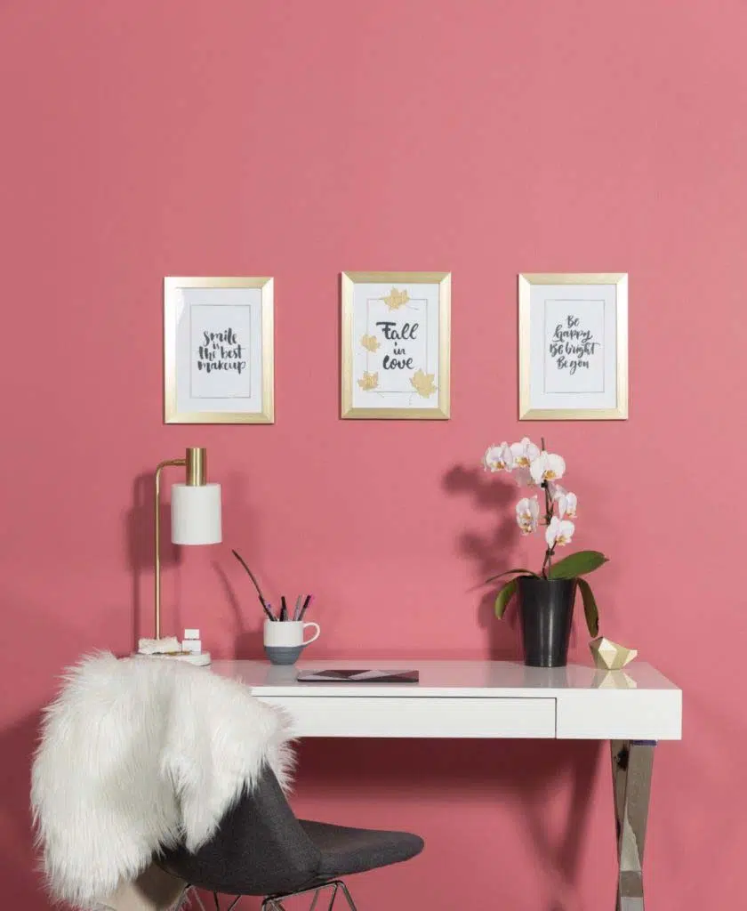
Walking over someone’s threshold is maybe as far as some people may travel into your home and so the entrance / hallway leaves a huge first impression. Considering the entrance or hallway tends to travel into every other room, it is generally wise to choose a colour that is quite neutral and something that will compliment other colours. For this very reason I would recommend picking from the new Ventura collection, a range with beautiful, subtle neutrals that will compliment virtually any other colour leading off it. With regular light levels, I use Equine– this colour is best used in a matt finish for a high-end look that will add a sense of elegance to any hallway. Feather Grey, a colour that has a deeper tone that also works beautifully in a light filled hallway.

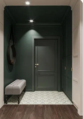
Where light is an issue, for instance that long corridor effect hallway with no natural daylight but many doors leading off it, maybe consider using the strongest colour on the ceiling. I often get asked whether this will make the room seem smaller and try to explain that by placing the most dominant colour choice on the ceiling, the walls tend to push outwards and so seem wider. The trick for these areas is to change the feeling of the room by running the colour above your head and maybe on and end wall to lead the eye to the direction you are travelling, whilst adding a splash of personality while you are at it! To really embrace this look I would go for a deep colour choice like Wynwood from the Vogue collection which works well with timber flooring, or maybe Betsy 1920 for a more inviting feel that will warm a hallway that may have a cooler, less tactile tiled floor. Combine these colours with a warn neutral like Coco 1955 Light and you will retain a bright but warm hallway.

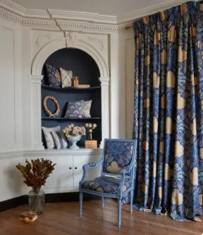
When faced with a more traditional high ceiling and stairs that travel up one side as you enter your home, I would suggest using mirrors to capture and bounce around ay available light you may have throughout the hallway. Where walls span the height of two storeys, I tend to steer away from using features like traditional dado height, lower panelling or paint and paper combinations which can tend to emphasise the height of the top storey and give the lower storey a shortened look. When considering panelling I would opt for picture rail height to add more interest to the area or the tallest wall solely in floor to ceiling boxed panels. For a modern interior, this wall can be colour blocked with pattern or if you would like to retain a more heritage feel then use one mid-range neutral colour like Fleetwood’s The Fall CP0215 here and highlight features like coving in a deep neutral like Stormy Weather from Pantone (one of my favourite dull greens/blue shades).

Colour Injections can still be used and in my own humble opinion encouraged!!! Again, by using a cocooned effect i.e., Inclusive of portions of walls and ceiling will alter long narrow shapes and help to define areas in halls that particularly have series of narrow long areas. Try using a common colour throughout like the bright and neutral Jet Stream from Pantone, combined with pops of Golden Apricot for vibrancy or Deep Teal for moody sophistication.
Challenges aside, there is a treatment for every hallway and maybe we should consider giving our hallways the treat they deserve. Embrace the quirks, love the low lighting, and feel the love for these rooms as the first impression truly does reflects the home within!
By Patricia Wakely